How to create dialog boxes with React hook and React context
A dialog/modal box is an excellent method to interact with users and elicit a response from them. A dialog box represents critical information on top of the application and regularly used for notifications, alerts, or standalone actions such as subscription forms.
Without further ado, Let's jump into it and create our very first React hook dialog box. We will kick this off by creating a React app, then we add our modal React hook, and finally, we wrap the app by a modal React context so we can show/hide modals from anywhere inside the app.
Set up your environment
You’ll need to have Node >= 8.10 and Yarn >= 0.25 on your local development machine. Let's ensure that you have the right versions installed, by running following command in the Terminal:
$ node -v && yarn -v
# [NODE VERSION]
# [YARN VERSION]
You should be able to see your Node version followed by Yarn versions.
Quick start with a new React app
We are going to take advantage of the "Create React App" and install a fresh React app at once. If you already installed the npm create-react-app package globally, perhaps you want to uninstall the package or remove it manually as it's not supported anymore, see the reported issue. Let's create a new React app and name it react-modal-app by running:
$ yarn create react-app react-modal-app
See: Get started with React App for more create app methods.
Time to run the app
$ cd react-modal-app
$ yarn start
Then open http://localhost:3000/ to see your app. 🎉
Create your modal
Create the context folder
$ mkdir src/context
Create the context file
$ touch src/context/modal-context.js
Your files and folders should look like this:
react-modal-app/
| ...
├── src/
|   ├── context/
|   |   | modal-context.js
Now we created our context files, Let's code the modal-context.js by importing dependencies:
import React, { useCallback, useEffect, useState } from 'react'Create a React context
const ModalContext = React.createContext()
Declare the modal component
const Modal = () => {}Create a context provider
const ModalProvider = props => {
  const [modal, setModal] = useState()
  const unSetModal = useCallback(() => {
    setModal()
  }, [setModal])

  return (
    <ModalContext.Provider value={{ unSetModal, setModal }} {...props} >
      {props.children}
      {modal && <Modal modal={modal} unSetModal={unSetModal} />}
    </ModalContext.Provider>
  )
}
Perfect, Now we are able to wrap our app with the newly created context provider, with this we can render our dialog message from the modal value state on the screen, we also want to be able to close the dialog box, or technically change the modal state to null or undefined, that being said, to showing a dialog we do setModal(<Example/>) and to hiding any dialog box we only need to do setModal(null|undefined).
Nevertheless, we create an unset model method and pass it onto the app context and Modal component, Even though this might look unnecessary, it will be a savior when we want to close the modal if a user clicks on close (X) button or hits ESC key, so let's give it a shot. 🤪
Create a custom hook
const useModal = () => {
  const context = React.useContext(ModalContext)
  if (context === undefined) {
    throw new Error('useModal must be used within a UserProvider')
  }

  return context
}
Ok, now we got the useModal hook which is carrying out unSetModal and setModal methods those are responsible for showing and hiding modals, later on, its time to finish off the Modal component that we declared earlier
const Modal = ({ modal, unSetModal }) => {
  useEffect(() => {
    const bind = e => {
      if (e.keyCode !== 27) {
        return
      }

      if (document.activeElement && ['INPUT', 'SELECT'].includes(document.activeElement.tagName)) {
        return
      }

      unSetModal()
    }

    document.addEventListener('keyup', bind)
    return () => document.removeEventListener('keyup', bind)
  }, [modal, unSetModal])

  return (
    <div className="modal">
      <button className="modal__close" onClick={unSetModal} />
      <div className="modal__inner">
        <button className="modal__close-btn" onClick={unSetModal}>
          <svg height="20" width="20" viewBox="0 0 20 20" aria-hidden="true" focusable="false">
            <path d="M14.348 14.849c-0.469 0.469-1.229 0.469-1.697 0l-2.651-3.030-2.651 3.029c-0.469 0.469-1.229 0.469-1.697 0-0.469-0.469-0.469-1.229 0-1.697l2.758-3.15-2.759-3.152c-0.469-0.469-0.469-1.228 0-1.697s1.228-0.469 1.697 0l2.652 3.031 2.651-3.031c0.469-0.469 1.228-0.469 1.697 0s0.469 1.229 0 1.697l-2.758 3.152 2.758 3.15c0.469 0.469 0.469 1.229 0 1.698z"></path>
          </svg>
        </button>
        {modal}
      </div>
    </div>
  )
}
This component only will be used by the provider internally, it basically renders a div.modal, a close (X) button, an overly close button which let users click anywhere outside the modal and close the dialog box among the dialog content itself {modal}, further this component binds unSetModal to a keyup event listener and dismisses the dialog when the user hits ESC key.
Finally, Export the dialog provider and dialog hook we just built
export { ModalProvider, useModal }In the end, your modal-context.js file will look like this (see the file on github.com)
Congratulations on making it this far! 🎊We are done with the modal core functions, but we still need to wrap the app with context provider, call the useModal hooks and finally add some styles to our little dialog box.
Let’s wrap the app with the modal context provider we just created, to do so, open up src/index.js
Import the modal provider by adding
import { ModalProvider } from './context/modal-context'And wrap up the entire <App> with <ModalProvider> like so: (see the file on github.com)
ReactDOM.render(
  <ModalProvider>
    <App />
  </ModalProvider>,
  document.getElementById('root')
)
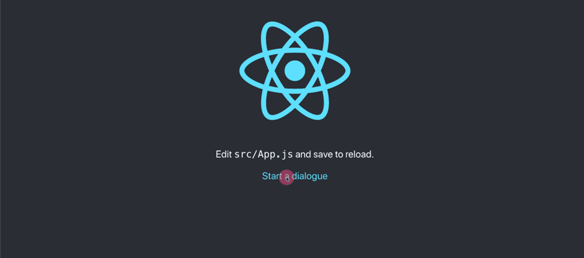
Fun round! Generating a modal; What we want is the user clicks on a button and a dialog box pops up, to get that working, open up src/App.js and import the modal hook
import { useModal } from './context/modal-context'Now use the hook inside the App component
const { setModal } = useModal()Lastly, create an element and attach the setModal to the onClick attribute (see the file on github.com)
<label
  className="App-link"
  onClick={() => {
    setModal(<h1>Hola senora!</h1>)
  }}
>
  Start a dialogue
</label>
By now, if you open up your browser you should be able to click on "Start a dialogue" button and see this:
Yeah! Looks blend! Let's add some styles to it, open up src/App.css and add following CSS codes (see the file on github.com)
.modal {
  --spacing: 24px;
  display: flex;
  align-items: center;
  justify-content: center;
  position: fixed;
  top: 0;
  left: 0;
  width: 100%;
  height: 100%;
  overflow: auto;
}

.modal__close {
  display: block;
  position: fixed;
  background: rgba(255, 255, 255, 0.5);
  border: none;
  top: 0;
  left: 0;
  width: 100%;
  height: 100%;
}

.modal__inner {
  position: relative;
  width: calc(var(--spacing) * 36);
  max-width: 100%;
  padding: calc(var(--spacing) * 3) calc(var(--spacing) * 1.5);
  border-radius: 5px;
  border: 1px solid rgba(0, 0, 0, 0.1);
  background-color: #ffffff;
  box-shadow: rgba(9, 30, 66, 0.25) 0px 20px 32px -8px;
}

.modal__close-btn {
  position: absolute;
  top: var(--spacing);
  right: var(--spacing);
  padding: 0;
  background: transparent;
  border: none;
  cursor: pointer;
}

.modal__close-btn svg {
  width: var(--spacing);
  height: var(--spacing);
  fill: currentColor;
  opacity: 0.5;
}

.modal__close-btn:hover svg {
  opacity: 1;
}
TA-DA! 🧚♂️

See this project on GitHub github.com/hesambayat/how-to-create-react-dialogs-tutorial
Thank you!
Thank you for reading! I hope this article could inspire you or even better you would use it in your project.